INQUIRER FILE PHOTO
You’ve laughed at the parodies. Now comes the serious part.
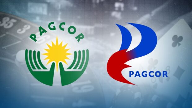
Two days after being unveiled, the new logo of the Philippine Amusement and Gaming Corp. (Pagcor) continued to draw scrutiny not only for its design and rationale, but also for its P3-million price tag and other issues.
Members of the Makabayan bloc at the House of Representatives on Wednesday afternoon filed a resolution seeking an inquiry into the “questionable” contract awarded by Pagcor for the rebranding project.
The lawmakers noted that the contract was awarded to Printplus Graphic Services, an entity enrolled in the Philippine Government Electronic Procurement System (PhilGEPS) just last month and registered in the Department of Trade and Industry in March 2021 with “only a barangay scope for its business name.”
Filed by ACT Teachers Rep. France Castro, Gabriela Rep. Arlene Brosas and Kabataan Rep. Raoul Manuel, the resolution cited the wave of criticism triggered by the logo since being launched by Pagcor on July 11 for the gaming regulator’s 40th founding anniversary.
‘Incongruity’
The lawmakers cited what they considered an “incongruity between the amount of the contract and the output delivered by Printplus Graphic Services.”
“Netizens have noted the output’s similarities to the logos of a noodles brand and petroleum company, and that the new P3.036-million logo looks like something done by a Grade 1 pupil or kindergartner,” they said.
“It is imperative for Congress to ensure that public funds are used efficiently and effectively and that government agencies are held accountable for their actions,” they stressed.
The new Pagcor symbol was reportedly designed by multiaward-winning artist Fransisco Doplon, whose past works of note included commemorative logos for the University of Santo Tomas and the Cultural Center of the Philippines, among others.
A similar demand for Pagcor to explain came from an opposition senator on Thursday.
Why still outsourced?
“The questions popping up in the minds of the public are very reasonable: who proposed this new logo design? Isn’t matters like this supposed to be in-house jobs? If it is outsourced, who is that agency?” asked Sen. Risa Hontiveros.
“(This is) possibly worth an investigation and we in the (Senate) minority are aware that despite our continuous work on various bills, we expect a resolution to investigate this,” she said, adding:
“Why is Pagcor concerned with a change in logo when it could have been attending to other more urgent problems that needed urgent solutions—at least from the perspective of the Senate committee on women—such as how Pagcor-licensed Pogo companies have been involved in human trafficking and cyberscamming.”
According to Hontiveros, her office has also taken note of reports that Pagcor is spending a “substantial” amount for the construction of its main office.
Flame of change
Pagcor has yet to issue a statement addressing the brouhaha since the logo’s launch. But according to the emcee of its July 11 anniversary program, the new image “incorporates the element of fire associated with energy, inspiration, passion, and transformation (and) symbolizes the flame that ignites change and drives progress.”
But netizens—including some graphic artists—have since poked fun at the logo, some tweaking it a bit to make it look more like a rooster, a reptile or a horned demon.But behind the mockery was the recurring question: Why replace the old Pacgor logo at all?
—Reports from Melvin Gascon, Ron Domingo and Abby Boiser
